Zara Website redesign
Roles
UX/UI Designer UX Researcher
Tools
Figma, Miro, Google forms
Time frame
2 weeks
The Brief
Throughout this case study I will be looking my objectives to make Zara’s website much easier to navigate and become more user-friendly.
Deliverables
3 pages: Homepages & 2 other pages
Mobile and desktop compatible screens (Responsive)
Introduction
What is Ecommerce?
E-commerce refers to buying and selling goods and services online, including online retailers, marketplaces, and auction sites. It has grown rapidly due to the convenience and advantages it offers over traditional stores, and includes popular sites like Amazon and eBay.
How has eCommerce changed over the the decade and how has covid 10 impacted the space?
The e-commerce industry has undergone significant changes over the last decade, including the increasing popularity of mobile commerce, the rise of social commerce, and the growing importance of omnichannel retail strategies. Additionally, advances in technology have made it easier for businesses to start and scale e-commerce operations, while also improving the customer experience through features like personalised recommendations, fast and free shipping, and easy returns. The COVID-19 pandemic also accelerated the shift to online shopping, with many businesses pivoting to e-commerce as a means of survival.
Why Zara?
I first encountered Zara in 2013 when I was 16. However, the online store's poor usability posed challenges, leading me to shop in-store, which is inconvenient for me. This could be a concern for Zara, potentially resulting in lost revenue and new customers, as a suboptimal customer experience can have negative implications, such as:
Website desertion - When a visitor leaves the website before completing the desired action, a poor UX design decreases a sites click-through rate which affects a brands value.
Decline in sales - Zara has competition all over the internet so customers may choose to shop at a competitor brand such as Top Shop if the UX is more favourable.
Empathise
Problem
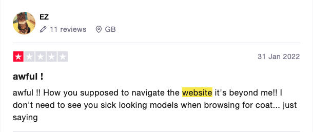
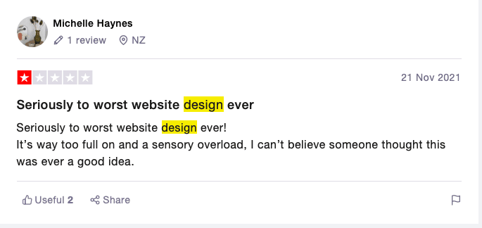
Zara has four core values: Beauty, Clarity, Functionality, and Sustainability. However, it's clear that two of these values - Clarity and Functionality - are not being fulfilled by the current website. My primary objective for the website redesign is to create a platform that fully aligns with the brand's core values. Reviews on Trustpilot show that Zara is not living up to its core values, which can result in website abandonment and a drop in online sales.
Research Phase
Competitor analysis
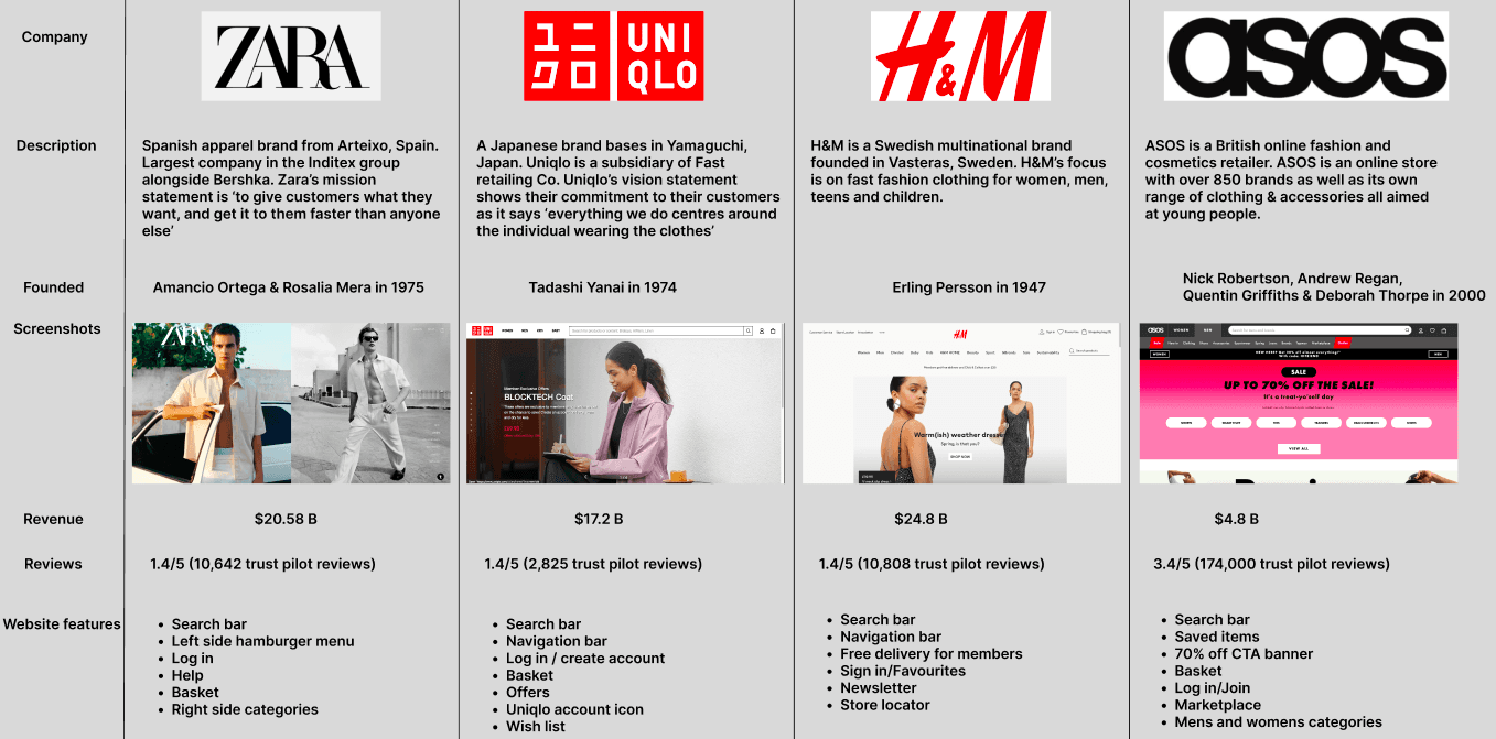
Competitor analysis findings
Uniqlo, H&M and ASOS all have clear and large search bars which is not the case with the ZARA website.
Uniqlo, H&M and ASOS all have a navigation bar at the top of their websites within the same area of the search bar whereas ZARA has the navigation at the bottom of the screen which makes it hard to find for the users. This goes against the UX law - Law of common region. The navigation being at the bottom combined with the background image carousel makes it inaccessible to those with visual impairments going against A11Y guidelines.
User Research (DEFINE)
Red route analysis
In order to gain insights into the fundamental aspects of e-commerce websites, I conducted a red route analysis. I surveyed a variety of e-commerce websites to identify the common features present across them. Subsequently, I gathered feedback from individuals on the frequency of their use of these features.
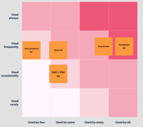
Findings
Upon reviewing the findings of the red route analysis, I found that the search bar and navigation bar emerged as the top two priority features for users. This aligns with my initial hypothesis, which was further confirmed by the results of the questionnaire I conducted. Additionally, I discovered that the 'sort products by' feature is not frequently used by many users. Based on these results, I conclude that the search bar and navigation bar are critical elements in providing an optimal user experience, and should therefore be given priority focus during the ideation and design phase.
Survey
In order to obtain deeper insights into the challenges faced by users when navigating the ZARA website, I conducted a survey using Google Forms, in which 19 participants aged between 19 to 32 years were asked a range of questions. The questionnaire included closed-ended questions to gather quantitative data and open-ended questions to gain qualitative insights.
Findings
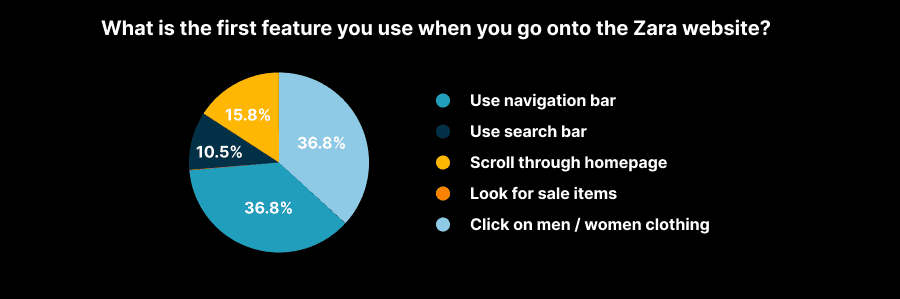
Based on the findings from my survey on the primary features that users tend to use first on the ZARA website, it is evident that the navigation bar holds the most significant importance. A total of 73.6% of the participants chose either 'use navigation bar' or 'click on men/women clothing', both of which are navigation-related functions. These results reinforce my hypothesis that the navigation system of the ZARA website should be given utmost priority.
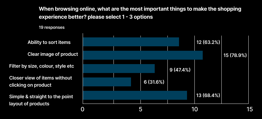
Results
Clear image of products
Simple layout
Ability to sort items e.g Price high to low, size etc.
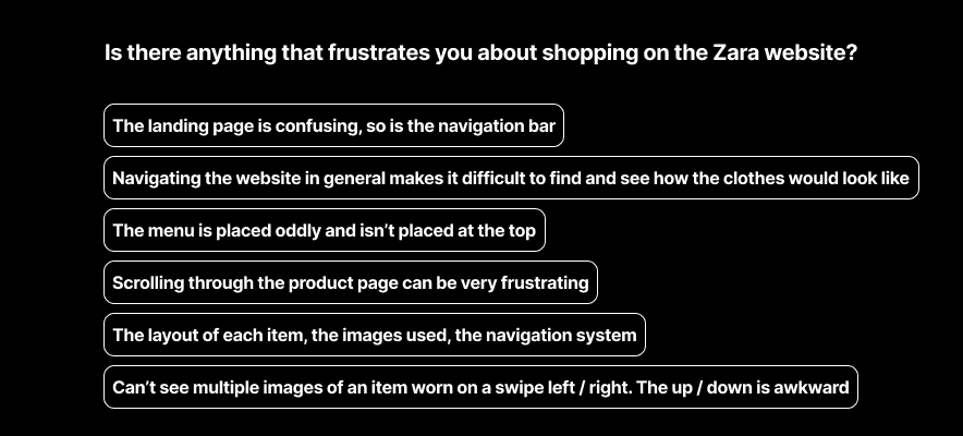
The findings of my survey have confirmed my hypothesis that many users struggle with finding & using both the current search bar and navigation bar on the website.
Main takeaways
navigation is difficult and needs to improve
Layout of items is confusing
Image usage is bad
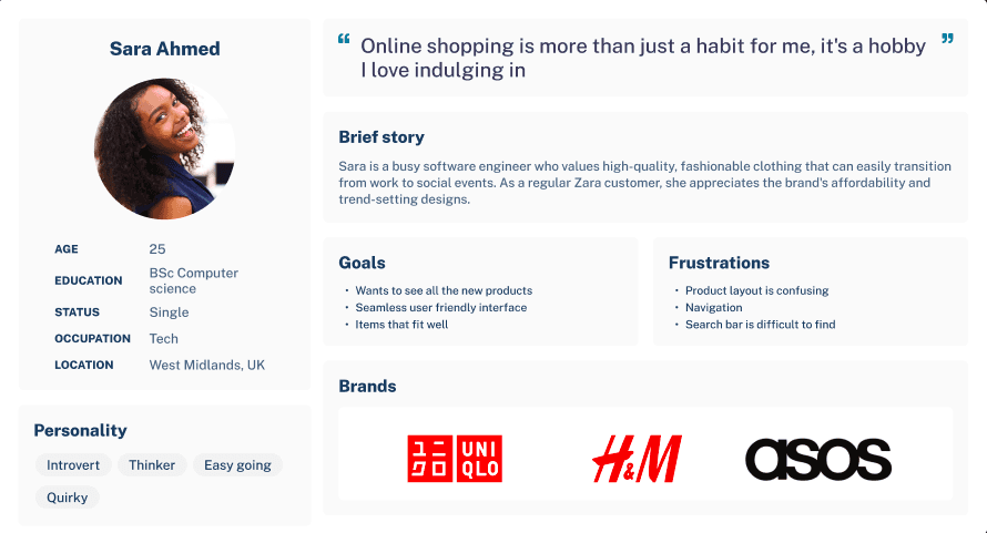
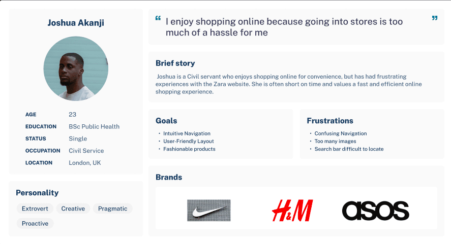
User persona
Ideate
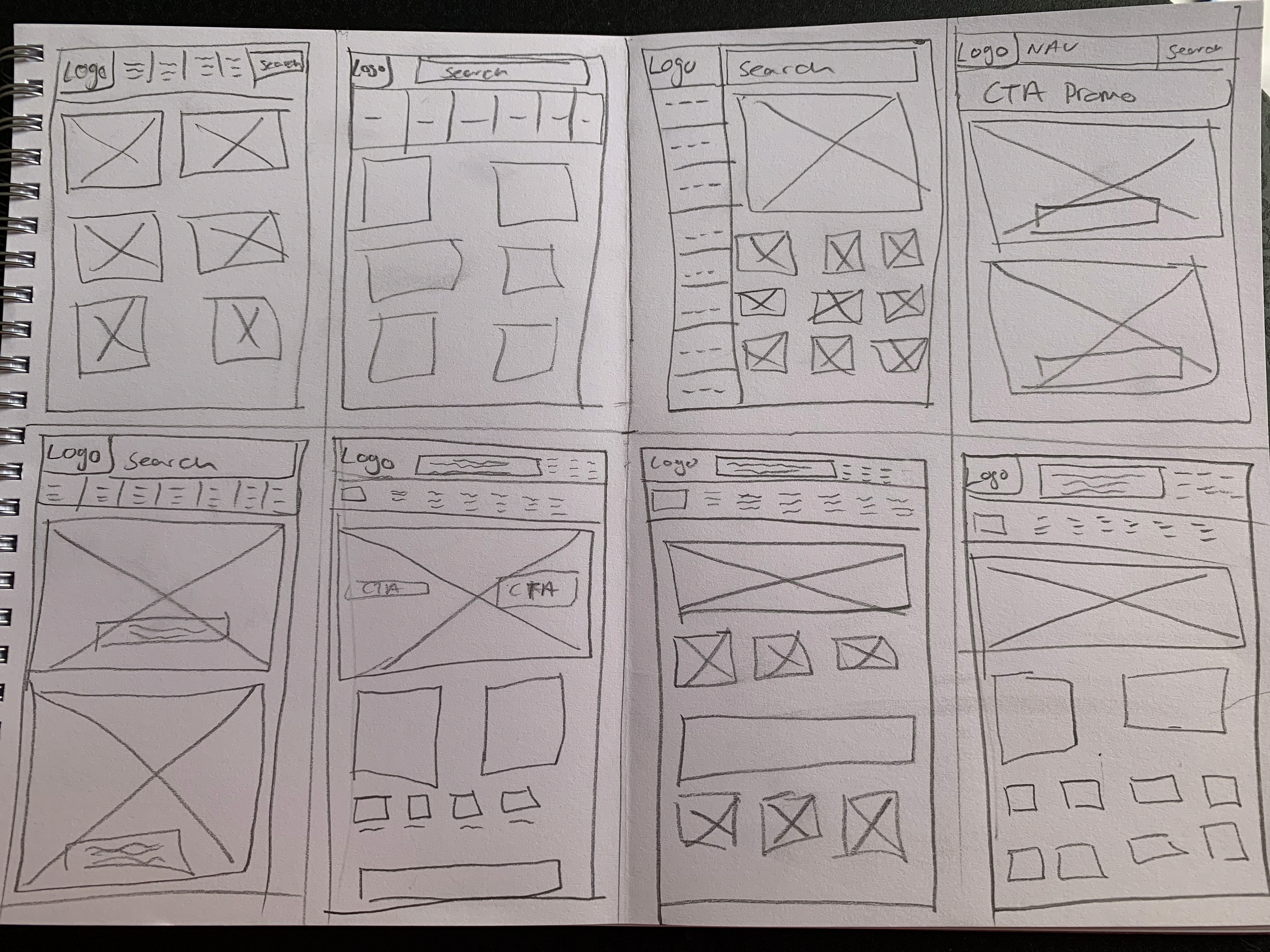
Crazy 8’s & A/B testing
8 DESIGNS, 1 PER MINUTE.
While conducting my Crazy 8s exercise, I made sure to consider the pain points of the user. After completing the exercise, I recruited five participants for A/B testing. From the ideas generated, I selected two screens that not only addressed the problem but also had an appealing aesthetic. I then presented these options to the participants and asked them to choose between the two.
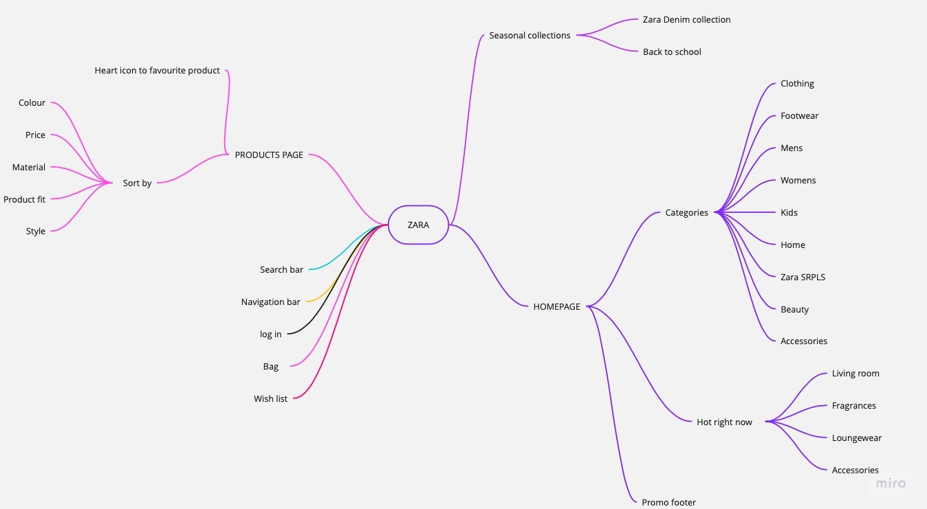
Mind map
During my UX design process, I used a mind map to visually organise my ideas and thoughts. A mind map is a diagram that helps to brainstorm ideas and organise them into a hierarchy. It was useful for me because I was able to easily see how different ideas were related to one another and identify potential gaps or areas where more research was needed. The mind map was an important tool in my UX design process and helped me to create a better user experience for my project.
DESIGN
Wireframes (Desktop & Mobile)
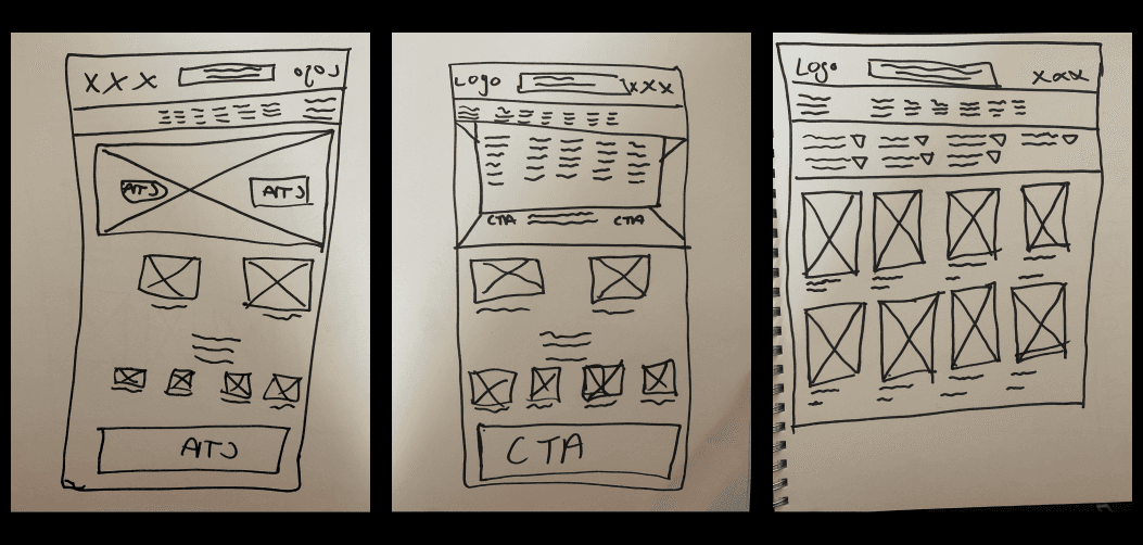
Low fidelity wireframes
The foundation for my low fidelity wireframes can be traced back to the ideation stage, where I drew inspiration from my mind map and crazy 8s exercises. These exercises served as catalysts, generating a multitude of innovative ideas for user-centric features. During my review of the crazy 8s sketches, an intriguing pattern caught my attention—a recurring motif of a striking large image banner positioned at the top of the page. Recognising the undeniable significance of this design element, I made it a priority to incorporate it into my low fidelity wireframes and meticulously carry it forward throughout the subsequent stages of the design process.
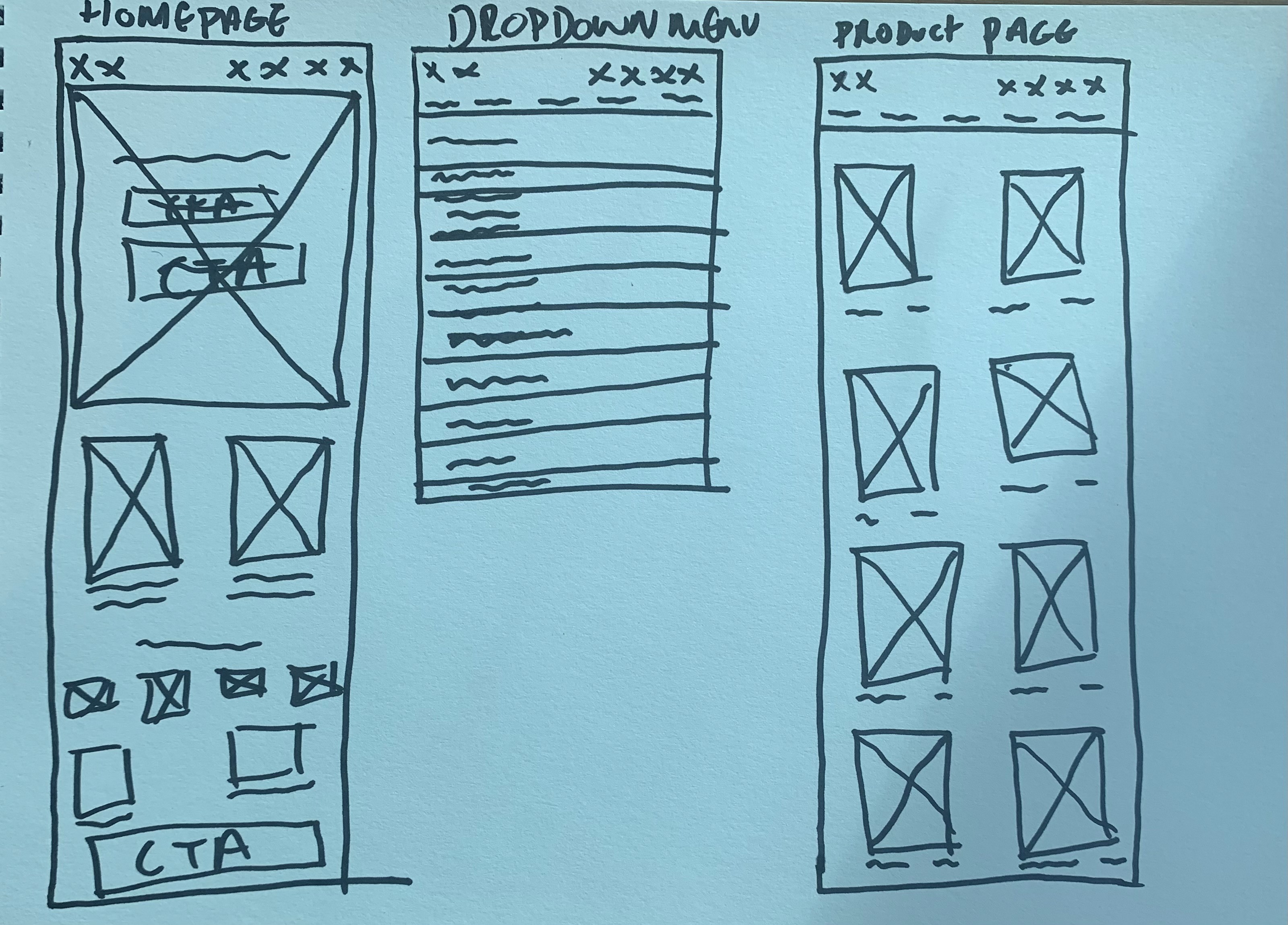
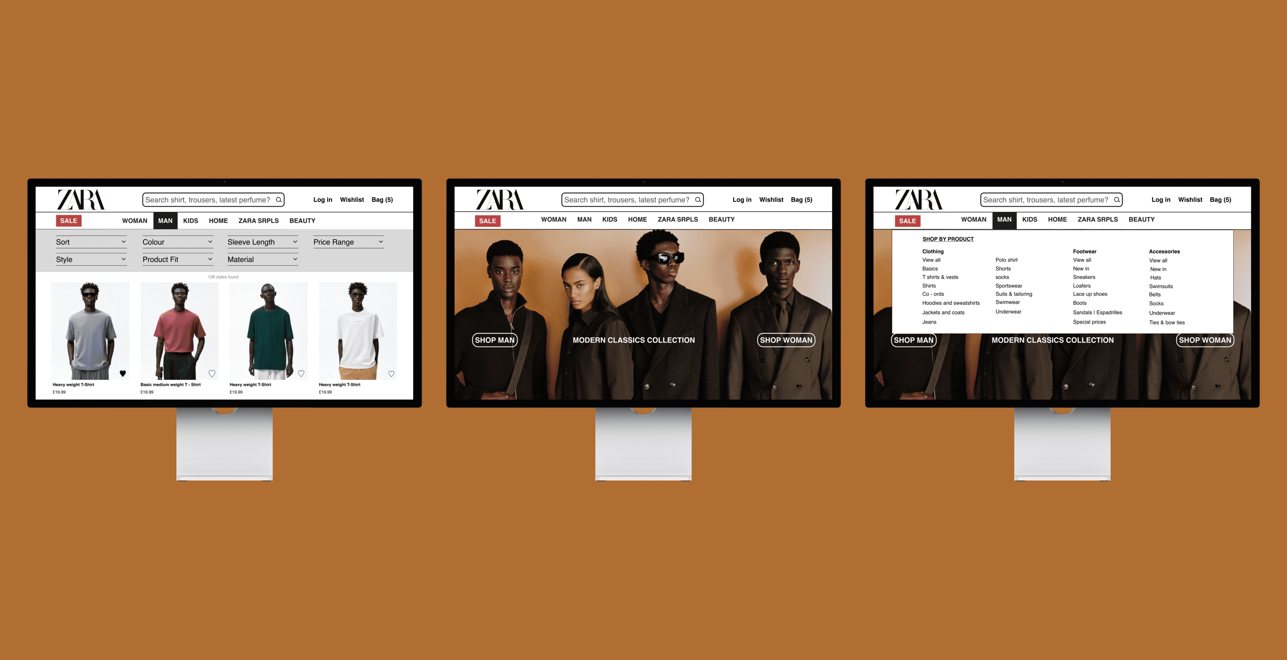
Mid fidelity wireframes
For the next stage, I advanced from low fidelity to mid fidelity wireframes using Figma to refine and enhance the designs. During this phase, I carefully evaluated my existing low fidelity wireframes and explored ways to improve them. One significant design change I identified involved the X icons in the navigation bar across all three pages. Considering the brand identity of Zara and the practices of its competitors like Uniqlo and H&M, I realized that using icon-only labels might not align well. To ensure consistency and clarity, I opted to replace the icons with text labels such as 'Log in,' 'Wishlist,' and 'Bag.' This decision aimed to maintain coherence with Zara's brand and provide a more intuitive user experience.
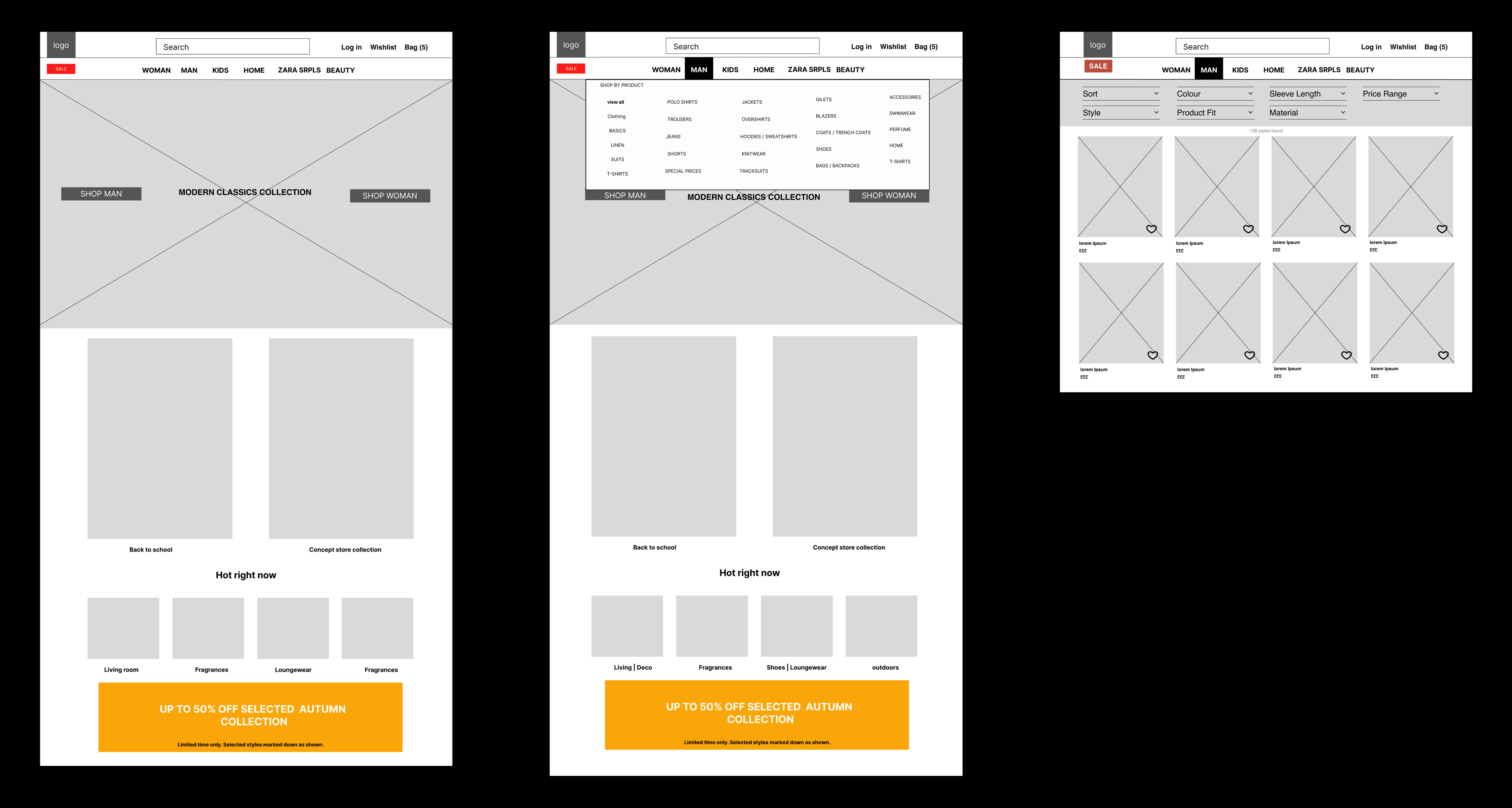
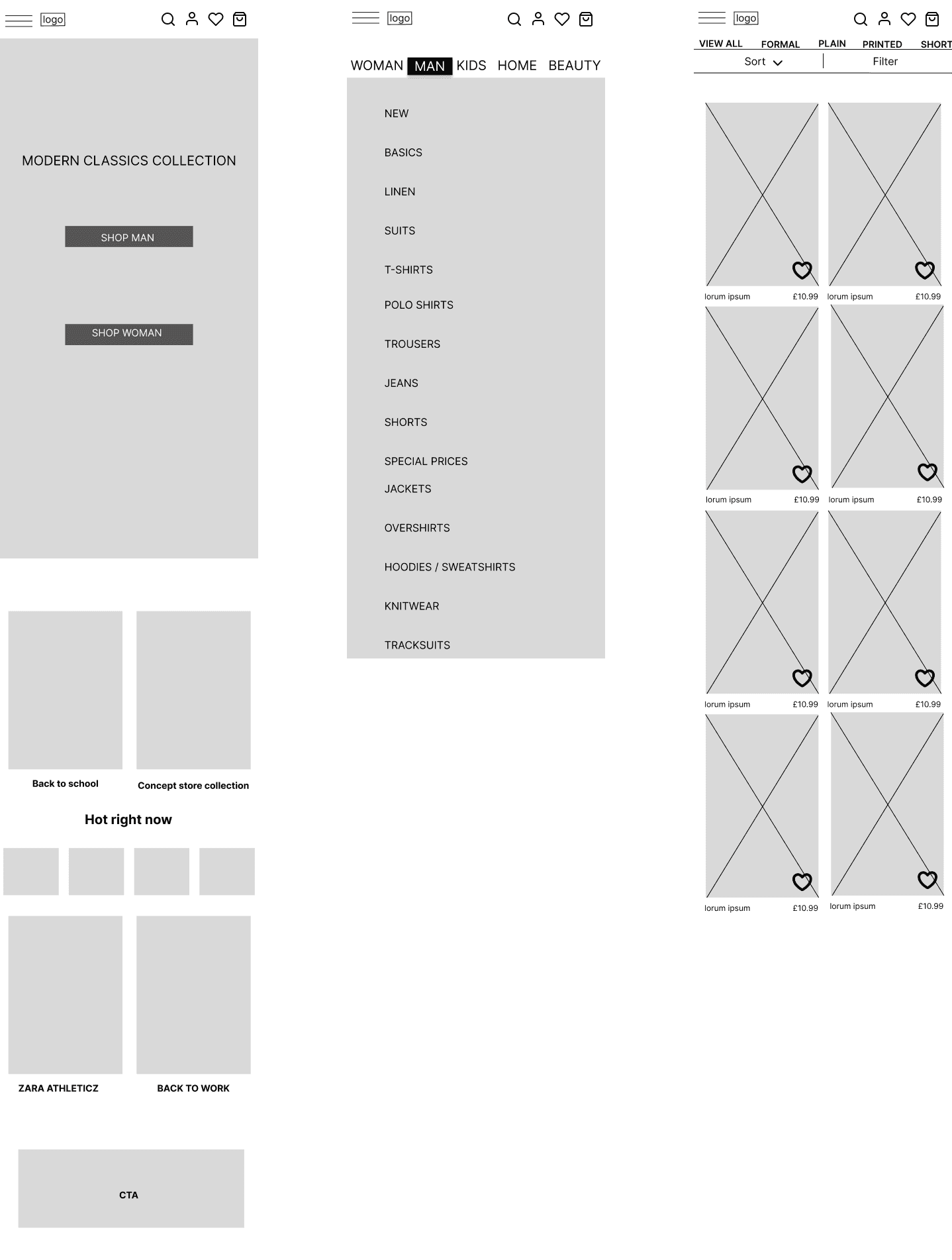
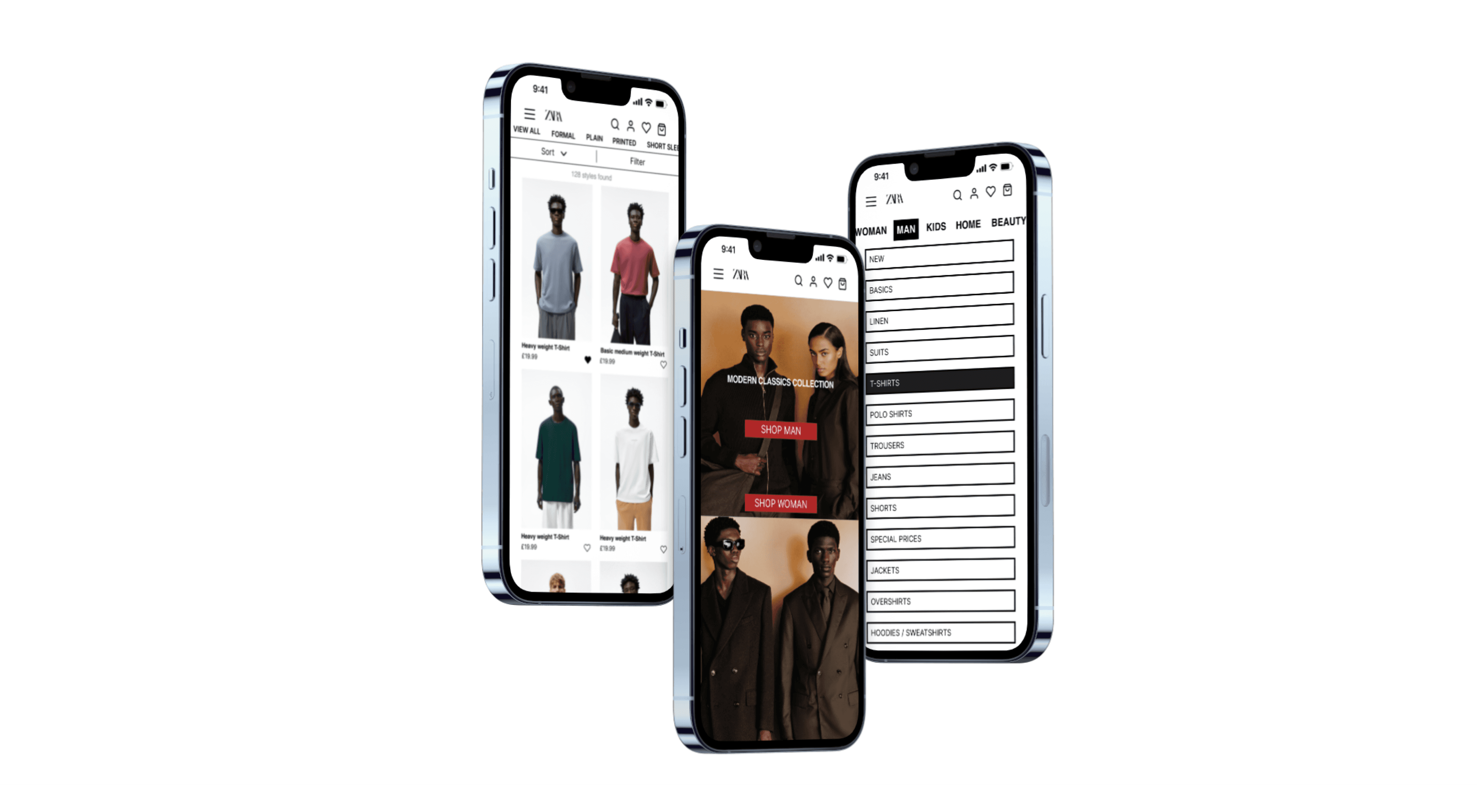
High fidelity wireframes
In the process of creating my high fidelity wireframes for a UX/UI project, I focused on elevating the visual experience through strategic image selection. To maintain cohesiveness, I carefully curated images from the Zara website that align with the brand's aesthetics. One key objective was to showcase the modern classics collection as the centerpiece of the design. Additionally, I implemented a gradient effect in the call-to-action (CTA) banner at the bottom to enhance the overall visual appeal. These refinements were aimed at creating a compelling and visually engaging interface that would resonate with users and contribute to a seamless user experience.
Design fundamentals
Hicks law
The principle of Hick's Law is evident in my designs, as I implemented minimal layouts on my screens. By presenting information in a clear and straightforward manner, I reduced the cognitive load for users. This streamlined approach enables users to quickly grasp and achieve their desired goals, saving them valuable time in the process.
Law of common region
The Law of Common Region plays a crucial role in my designs by leveraging the principle of proximity. This law is instrumental in organizing information effectively. To enhance usability, I utilised categorisation to differentiate various types of information. For instance, I categorised items such as food banks, find a meal, and emotional support into separate sections. Users can easily navigate through these distinct categories using horizontal scrolling, allowing them to explore different options within each category seamlessly.
Jacobs law
Users don’t like the norms to be changed from one product to another. It is key when designing the product to not reinvent the wheel but instead give the users what they are used to so that they can navigate through the website effortlessly. To gain a deeper understanding of this law I looked at competitors such as Uniqlo, H&M and ASOS. After finishing looking at what the competitors I noticed that a product page filter so that users can refine their search for specific products such as size, colour, price range.
Accessibility
Throughout my design process I made sure to consider the accessibility of my designs.
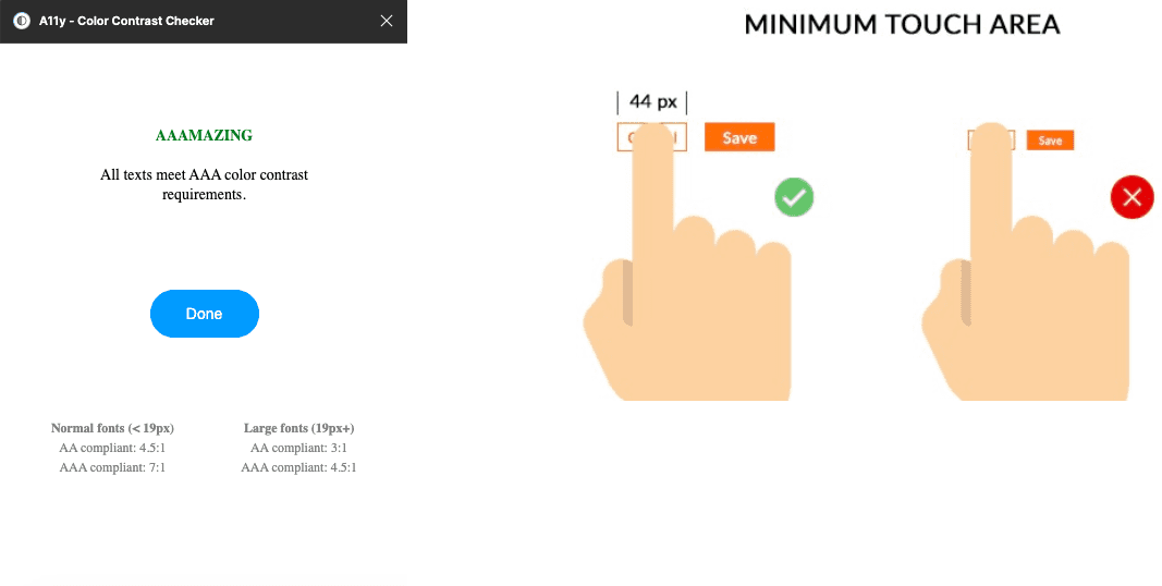
Colour contrasts where considered throughout the design process. I used A11y - color contrast checker and received AAA results
Size of all buttons is minimum 44px height and width
Font sizes are very important when looking at accessibility, For my desktop designs I made sure the font size above 16px and above 14px for mobile designs.
Conclusion
Throughout the process of this case study, I have had the opportunity to explore various ideas while keeping in mind design processes, laws, and fundamentals. This approach allowed me to improve my skills in both UX and UI design by constantly exploring new concepts and techniques. In retrospect, if I had more time to work on this case study, I would have liked to use additional research methods to gain a deeper understanding of user needs. Specifically, I would have preferred to use card sorting and face-to-face interviews to capture more behavioural and emotional cues from the participants when answering my questions. I would also have conducted product testing to gather feedback on what users like and dislike about my designs, ensuring that they align with both user needs and the goals of the business.