Hopespace
Roles
UX/UI Designer UX Researcher
Tools
Figma, Miro, Google forms
Time frame
2 weeks
Introduction
My goal for creating this app is to eliminate the pressures faced by homeless people. I wanted the homeless to have an all in one platform to access food, housing support, emotional and mental wellbeing services. Creating an app in which people could also use to donate money was crucial as it allows for the long term sustainability of services for the homeless.
What is homelessness?
Rough sleeping is the most visible representation of homelessness but there are a wide range of situations that would also constitute as homelessness such as sofa surfing, temporary accommodation, at risk of being homeless, statutory homelessness.
Empathise
User research - Understanding the user
Due to my inability to get primary research of the user I opted to search the internet for articles from the media and reports from homeless charities. Conducting secondary research allowed me to empathise more with people who have or are currently experiencing homelessness which allows me to understand what they need.

Competitor analysis
Research findings
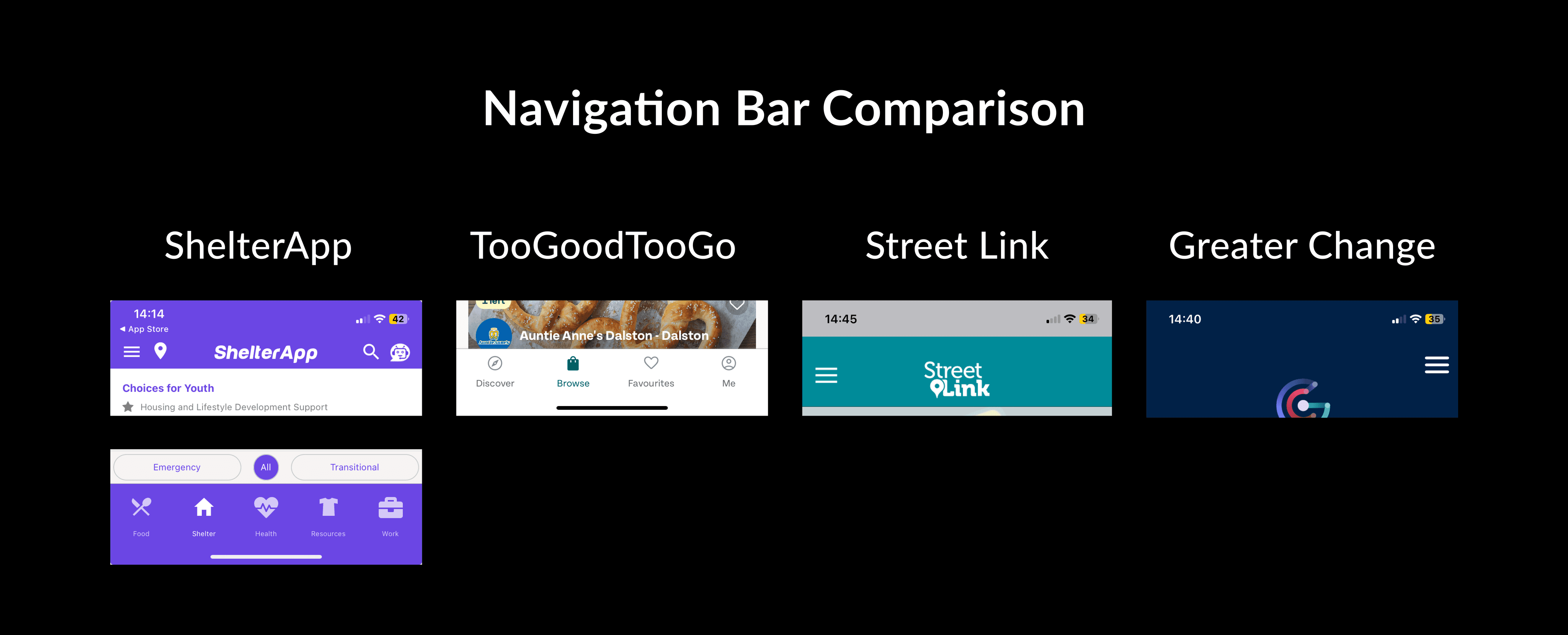
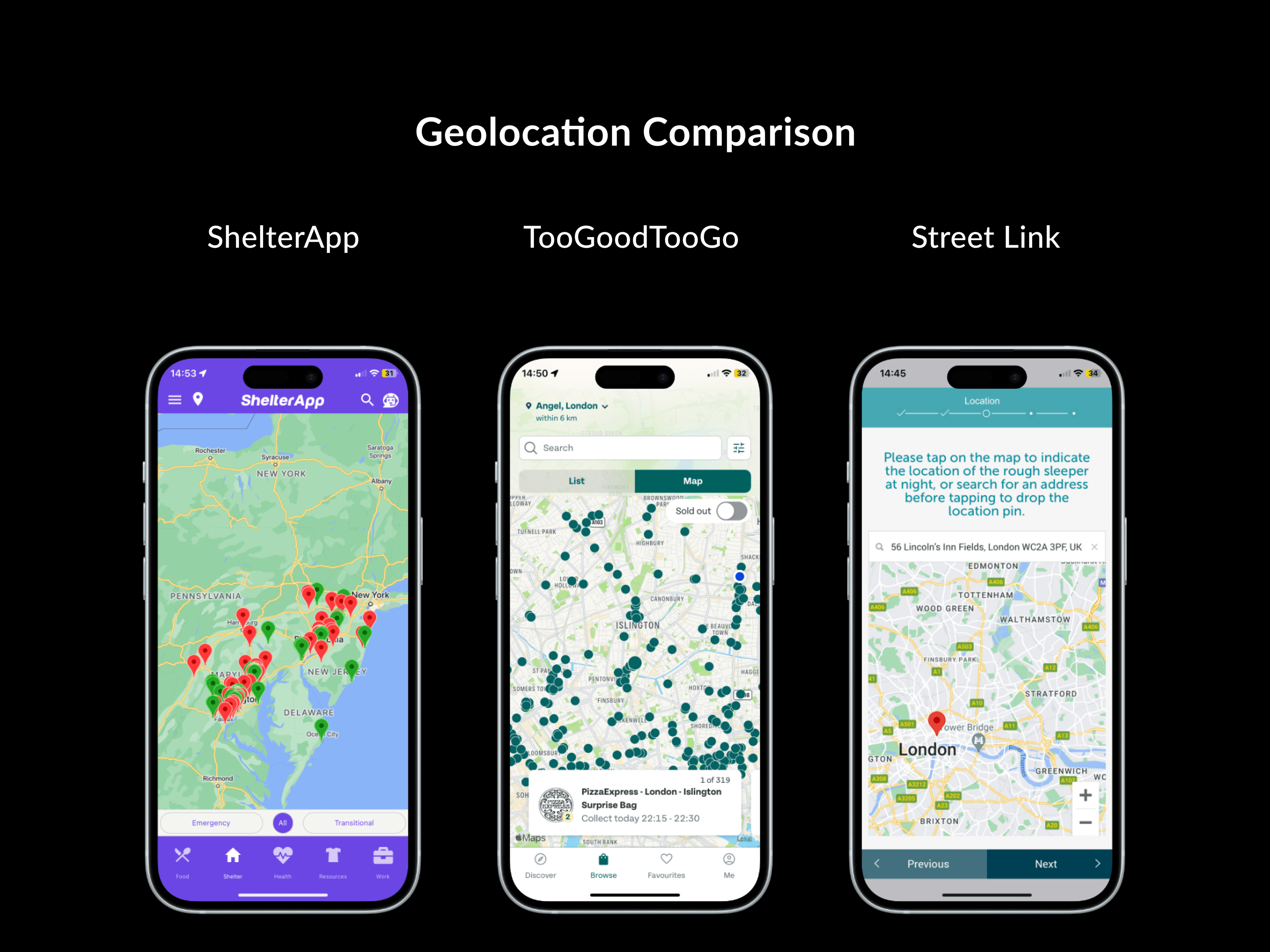
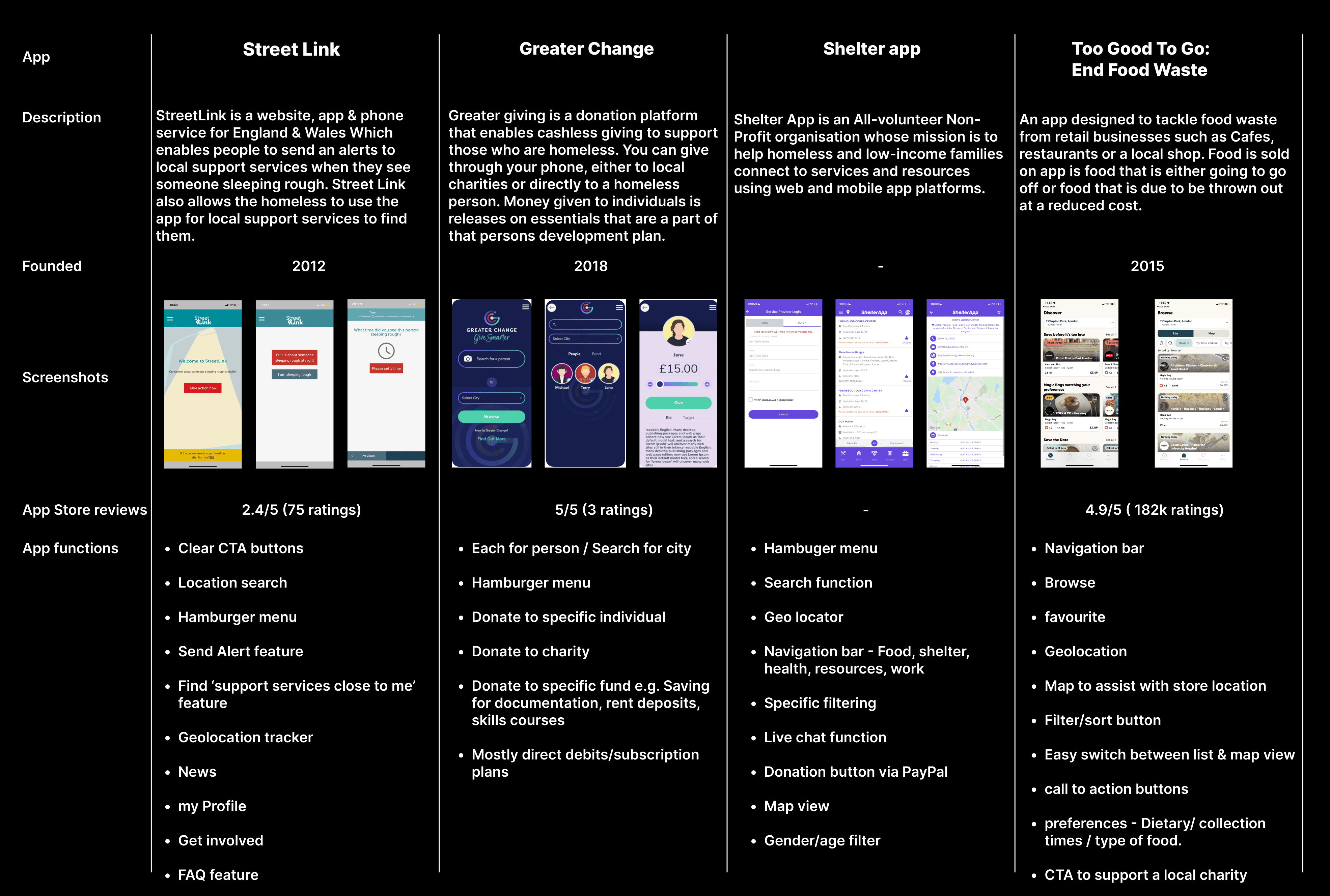
Homeless support apps have user-friendly layouts.
Navigation varies, with hamburger menus in Greater Change, Street Link, and Shelter App, while Too Good To Go uses a fixed bottom bar.
Geo-location is common, with Street Link's location alerts, Shelter App's map view, and Too Good To Go's filterable map and list views.
Survey
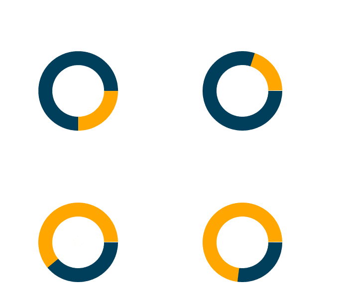
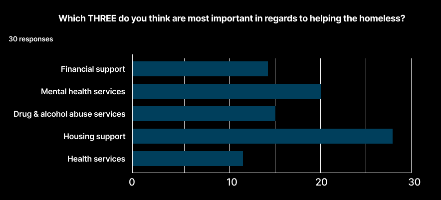
Unable to survey the homeless directly, I researched aid providers. A 15-question survey gauged demographics, homelessness involvement, and the app's user aims. Results affirmed community willingness to help and service accessibility challenges.
Key findings:
The 3 most important areas of concern regarding the homeless according to participants are:
Housing support
Mental health support
financial support
Define
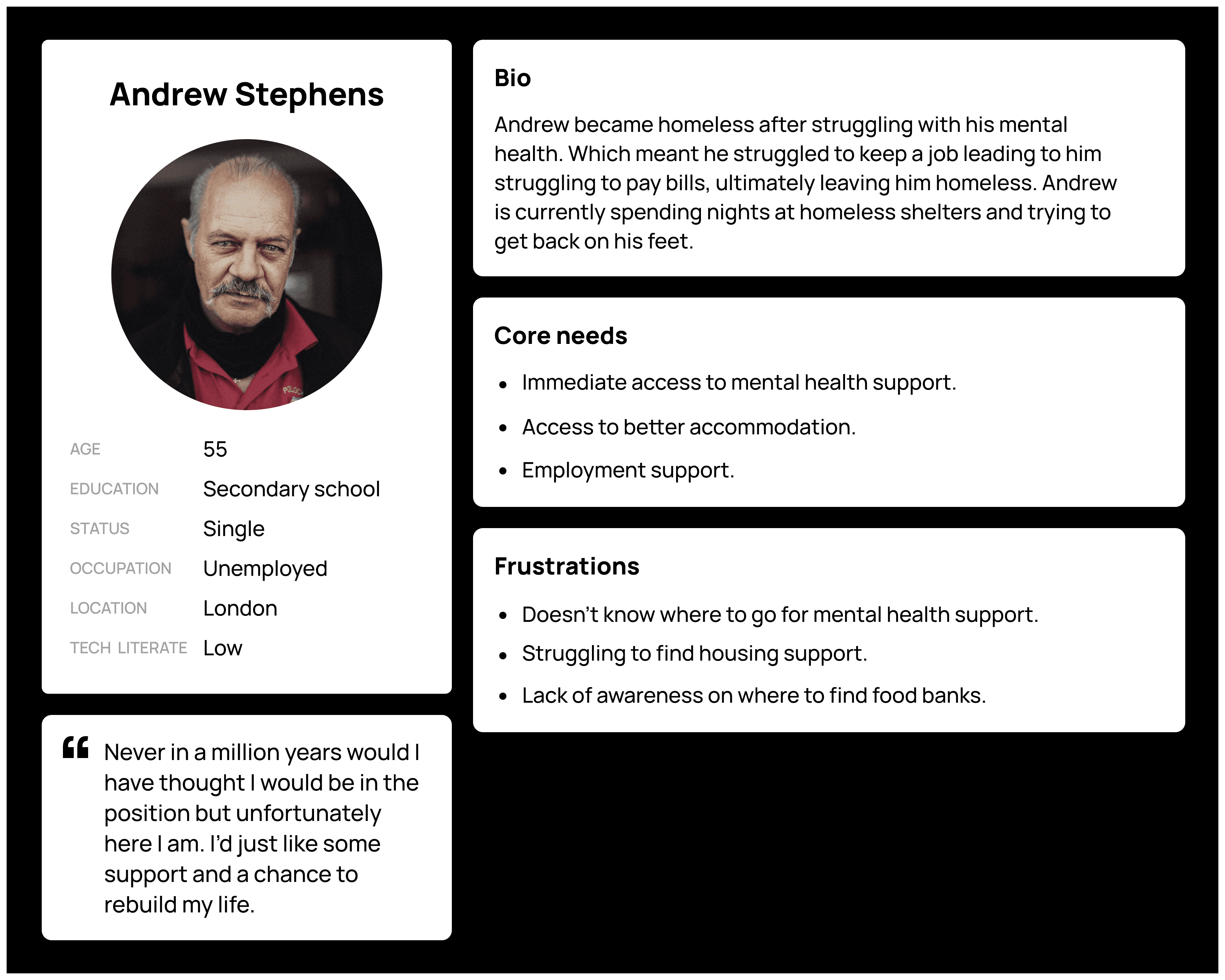
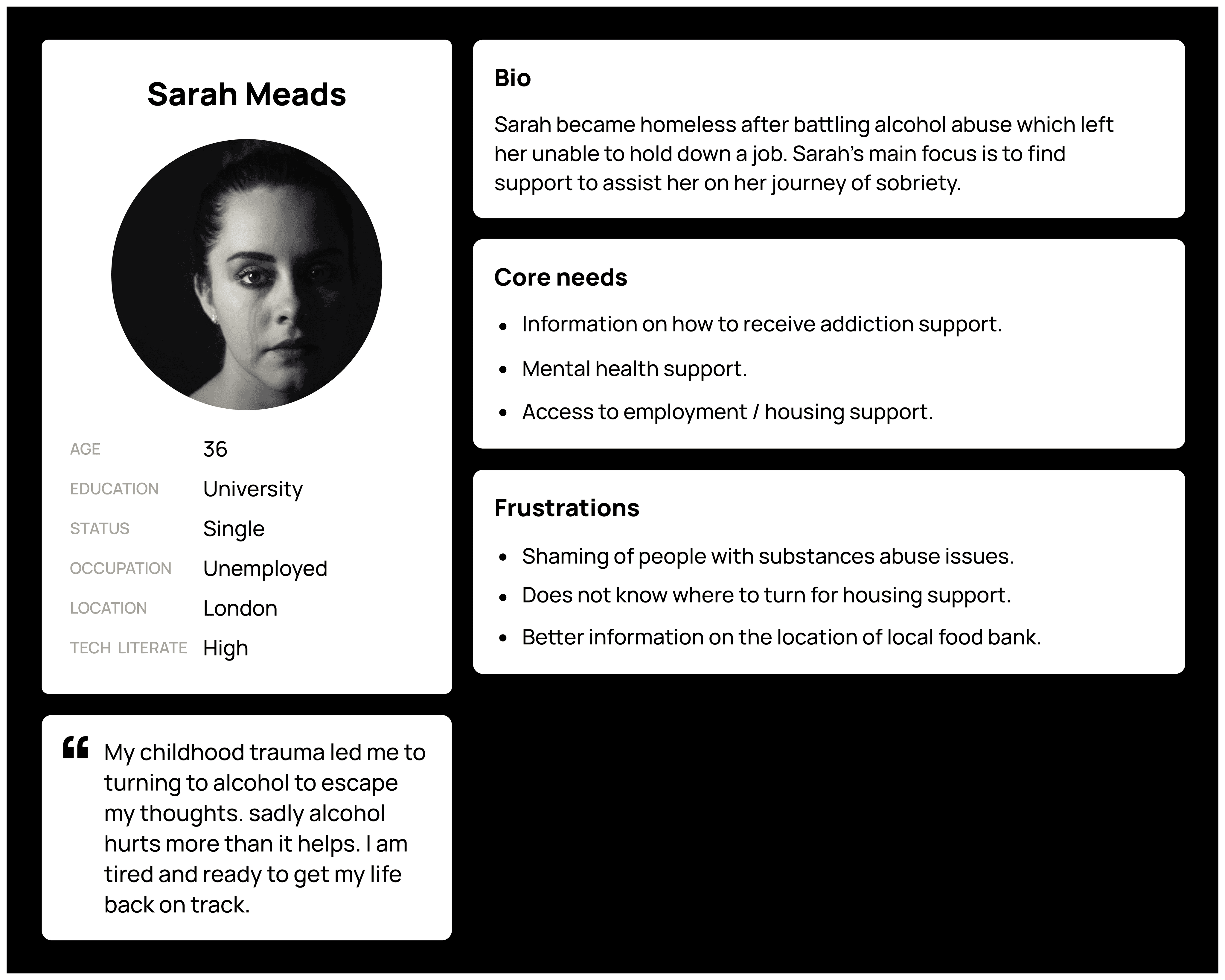
User persona
Ideation
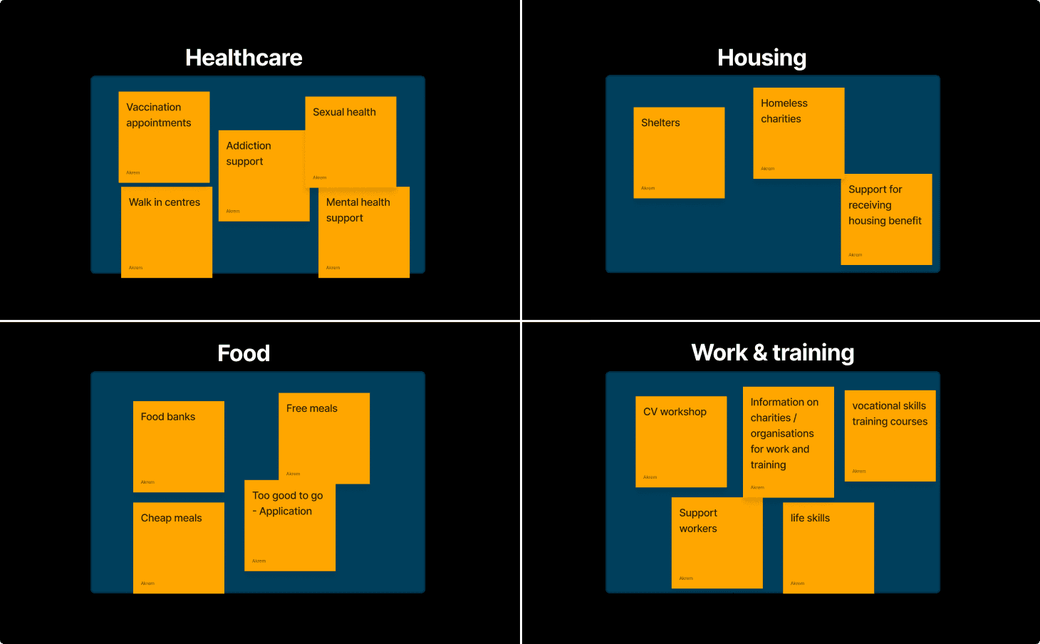
Card sorting
When initially conceptualising this app i knew that I wanted to create a section of the app which provides support in multiple different ways. I listed the different services i thought would be useful and sorted them into different categories.
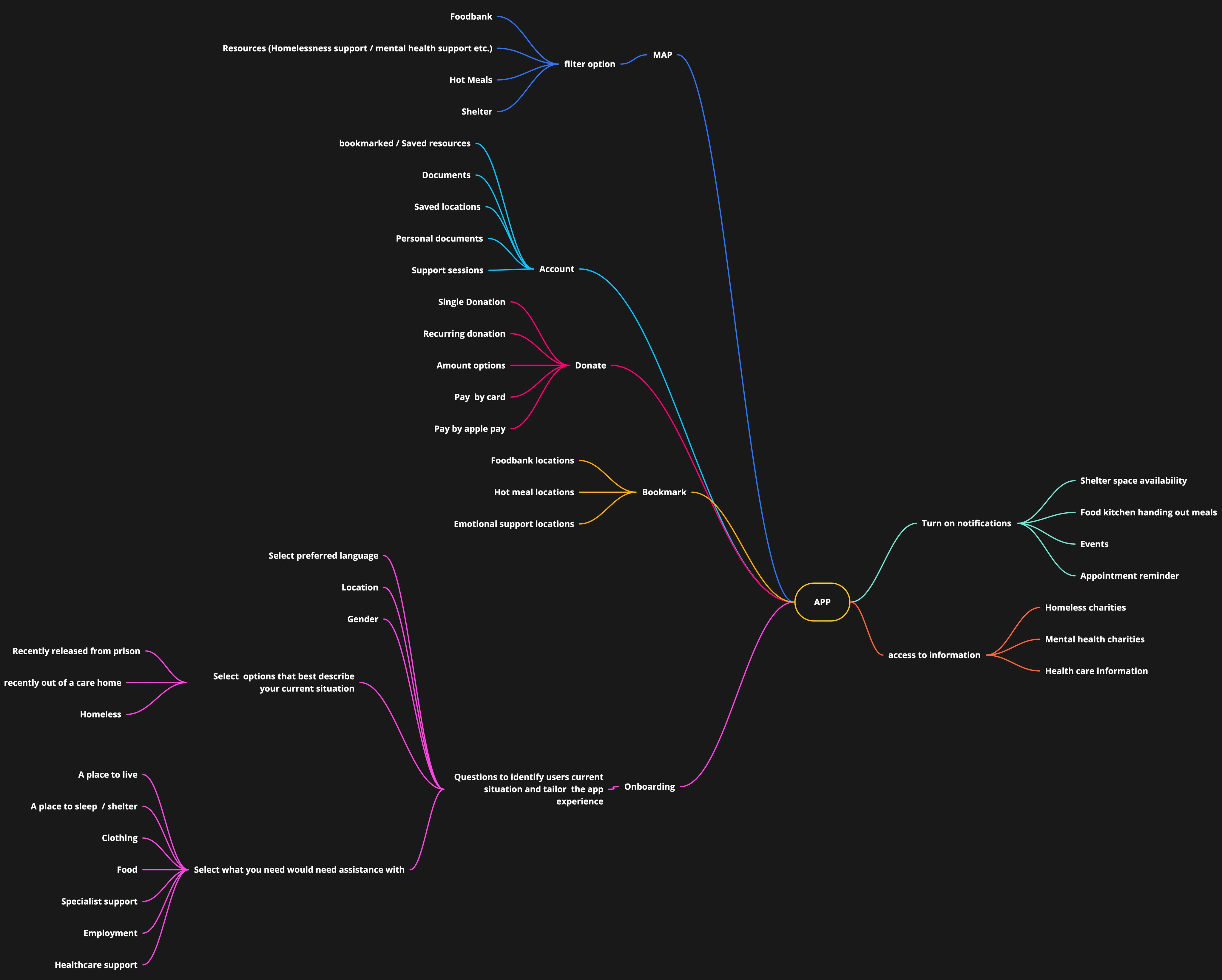
Mind map
As part of the ideation phase of this project, I decided to create a mind map. Mind maps are a great tool for generating ideas and helping with the visualisation of ideas and concepts during the early stages of a project. In this case study, the use of a mind map helped me understand the potential of the app and identify its core purpose, as well as generate ideas for features within the app.
Strawman proposal
Strawman proposal is an iterative process in which a group of colleagues come together to dissect an idea and come up with better ideas. This process is timed and when the time is up the group comeback together discuss negatives in the design and solutions for a better more useable design.
Design
Mid fidelity wireframes
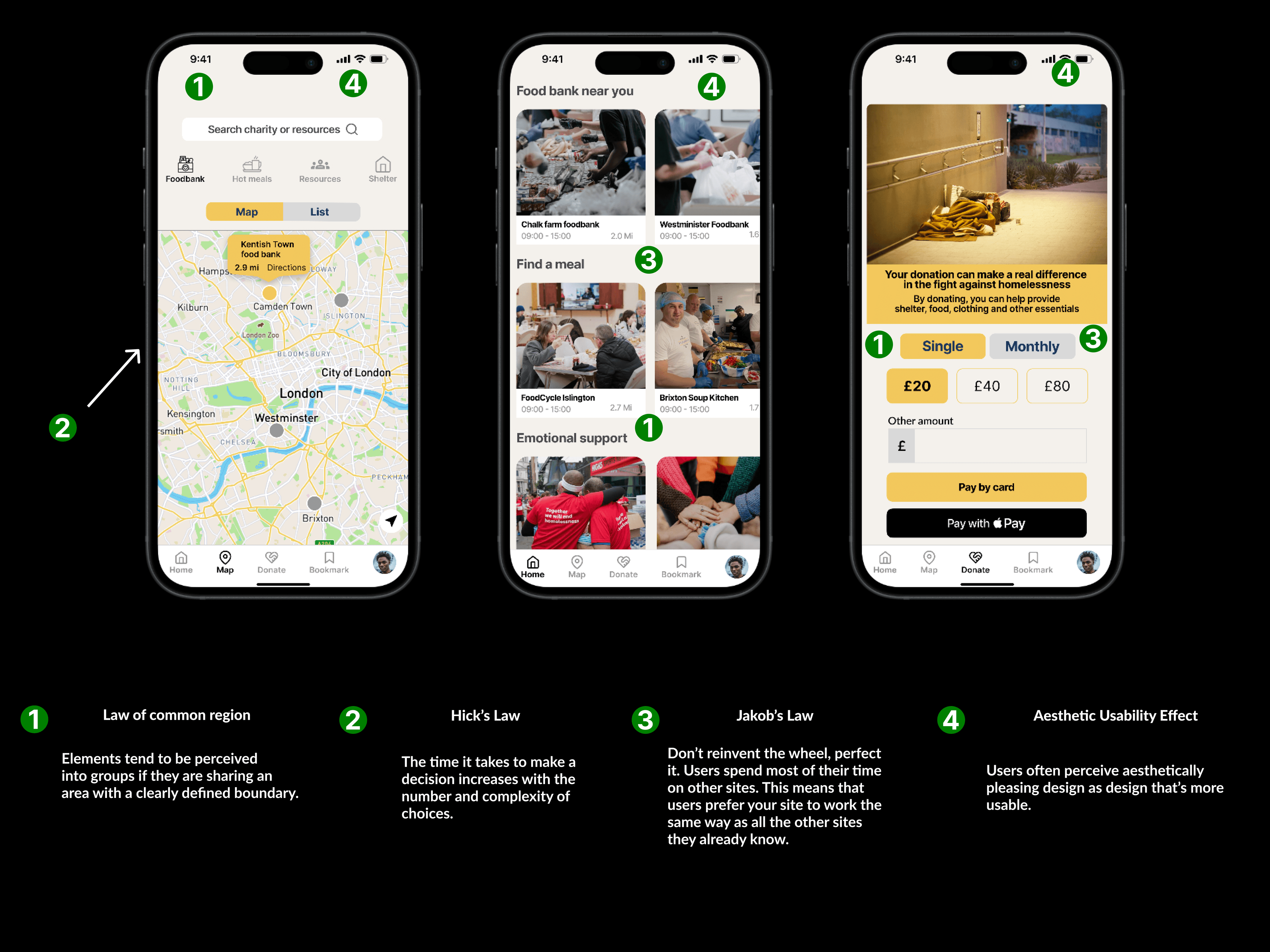
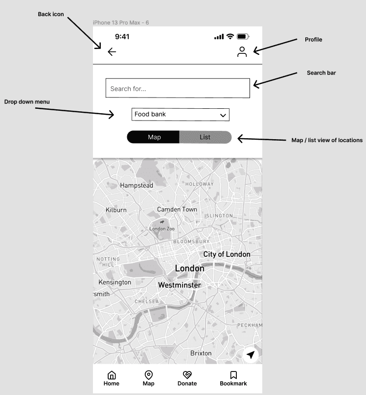
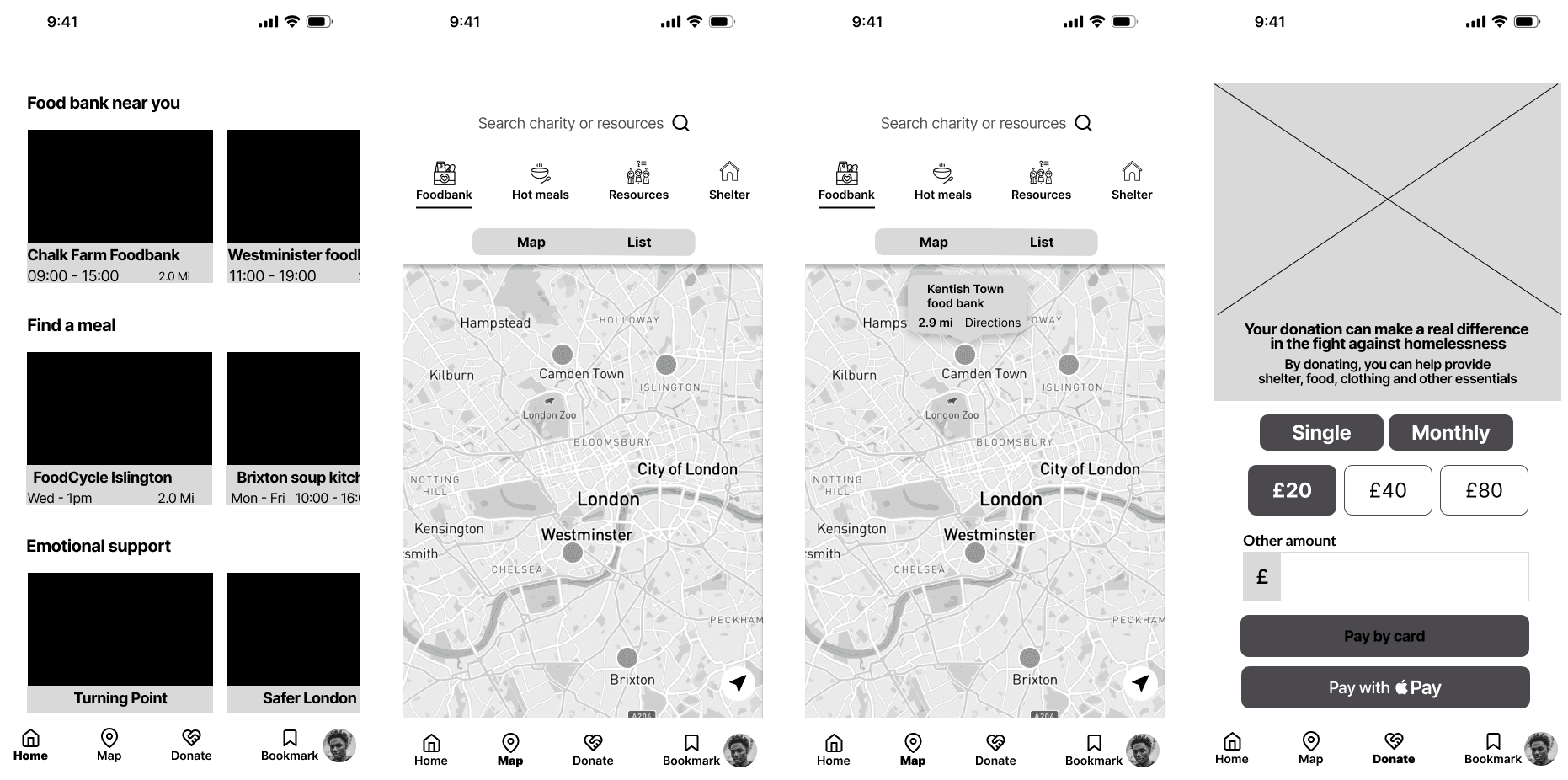
For the mid fidelity wireframes, I utilized Figma to create more realistic designs and refined my ideas before proceeding to the high fidelity wireframes. During the mid fidelity design phase, I made several enhancements. On the homepage, I removed the hamburger menu since it didn't provide much value to users, especially considering that the bottom navigation bar contained all the necessary features. When comparing the low fidelity and mid fidelity maps page, I eliminated the dropdown menu and toggle, as they were not beneficial to the user. Instead, I retained the search bar and incorporated a map-list toggle. To improve accessibility, I added a navigation bar with icons for easy navigation for visually impaired users. Additionally, I introduced a profile page that featured a user's photo alongside their personal information.
High fidelity wireframes
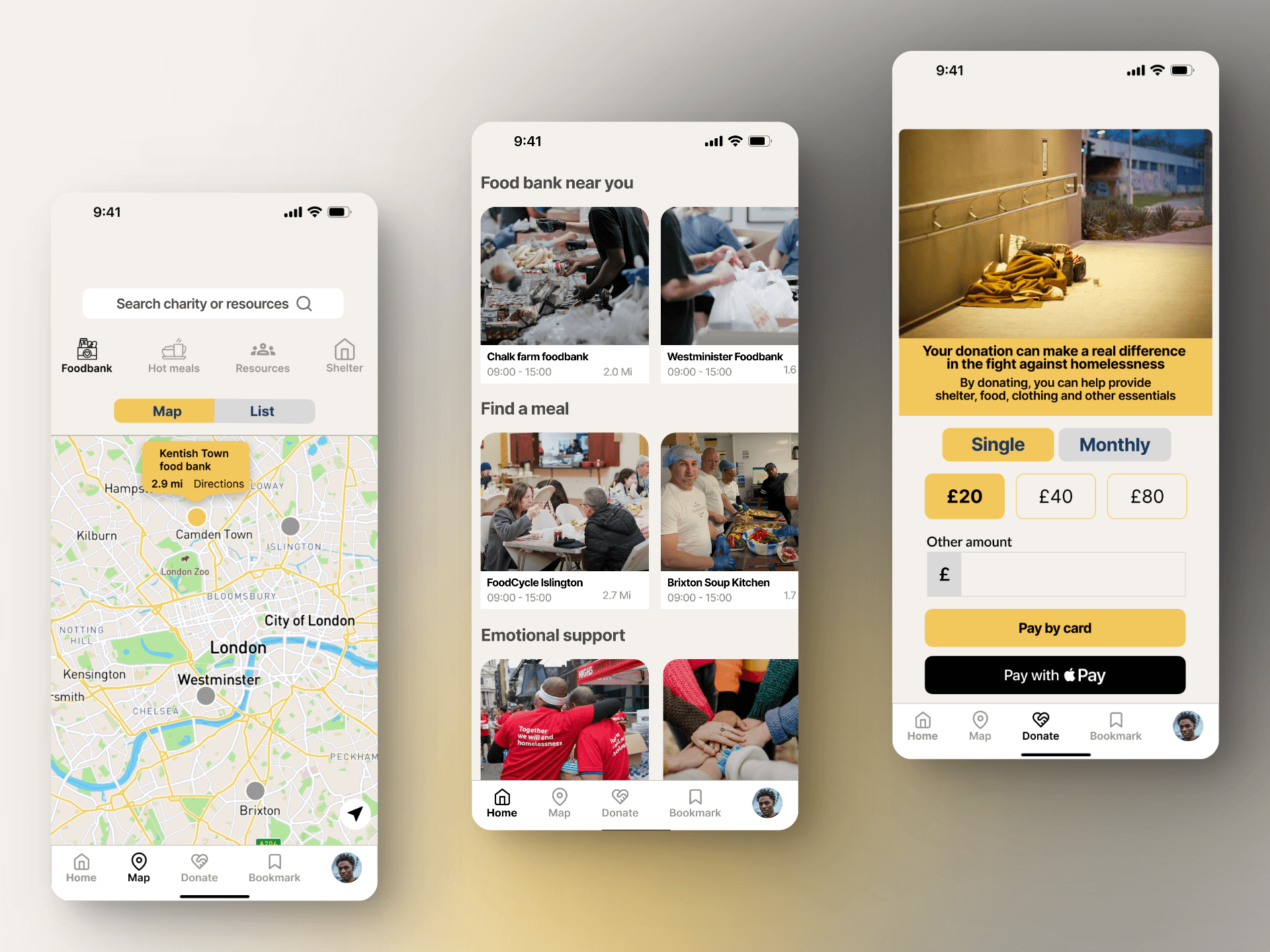
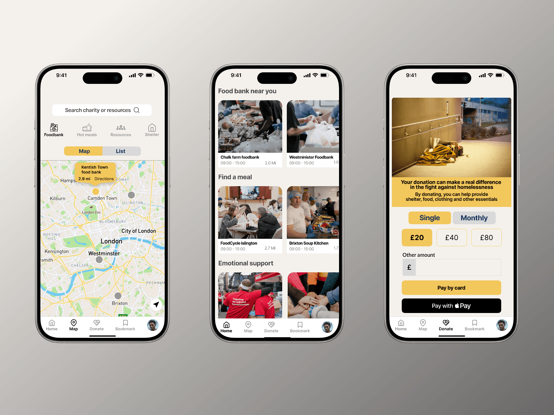
When it came to designing my high fidelity wireframes, I maintained the same screens and layout from the previous mid fidelity stage as I was satisfied with the design. To enhance the visual appeal, I searched the internet for appropriate images to replace the placeholders, ensuring that they effectively represent the organizations. Additionally, I created a dedicated screen for the maps page, showcasing the user experience when clicking on a pin. This feature displays relevant information such as the service name, distance, and directions to provide users with a seamless and informative experience.
Design principles
